


Objectives for Tego’s Stationery & Letterhead Design
Reflect Brand Evolution: Visually reinforce Tego’s transition from TegoTech to Tego with a modern, clean design that aligns with the updated brand identity.
Promote Brand Consistency: Ensure all business communications—print and digital—use standardized stationery elements, maintaining visual cohesion across materials.
Enhance Professionalism: Present a polished, credible brand image in all formal correspondence to build trust with partners, investors, and customers.
Support Accessibility: Use legible typography, high-contrast layouts, and clean formatting to ensure readability for individuals with visual impairments.
Subtly Reinforce Product Innovation: Integrate visual cues, such as the magnetic motif in the logo, to subtly reference the company’s flagship product and its focus on safety and usability.
Ensure Print and Digital Flexibility: Design stationery that adapts seamlessly for both physical and electronic formats, maintaining clarity and brand presence in every context.
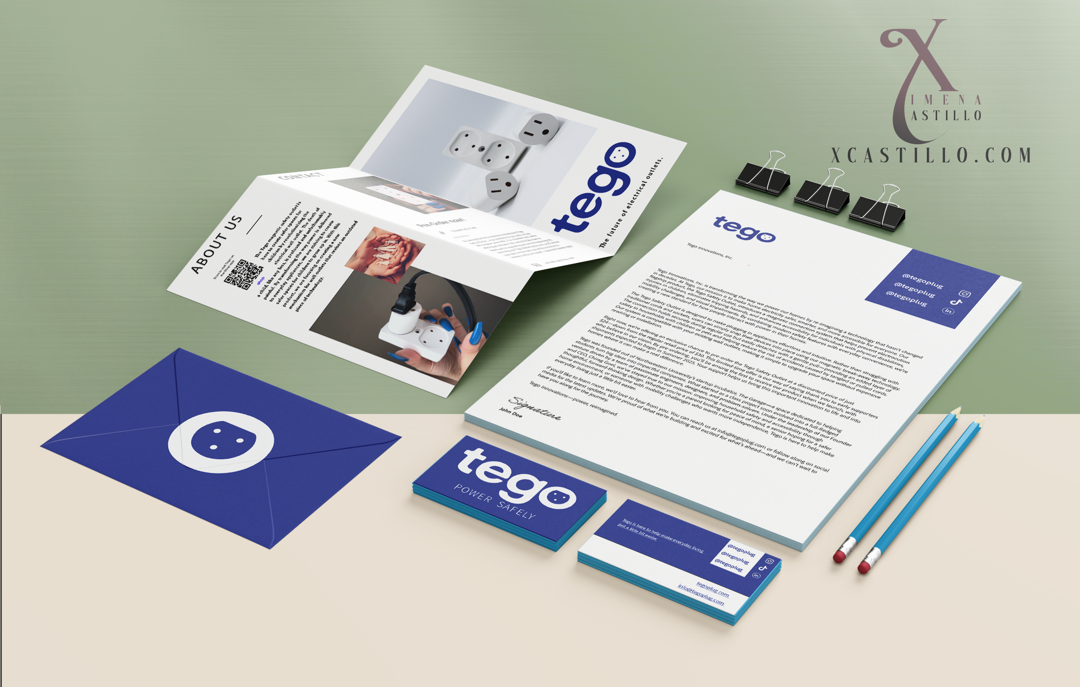
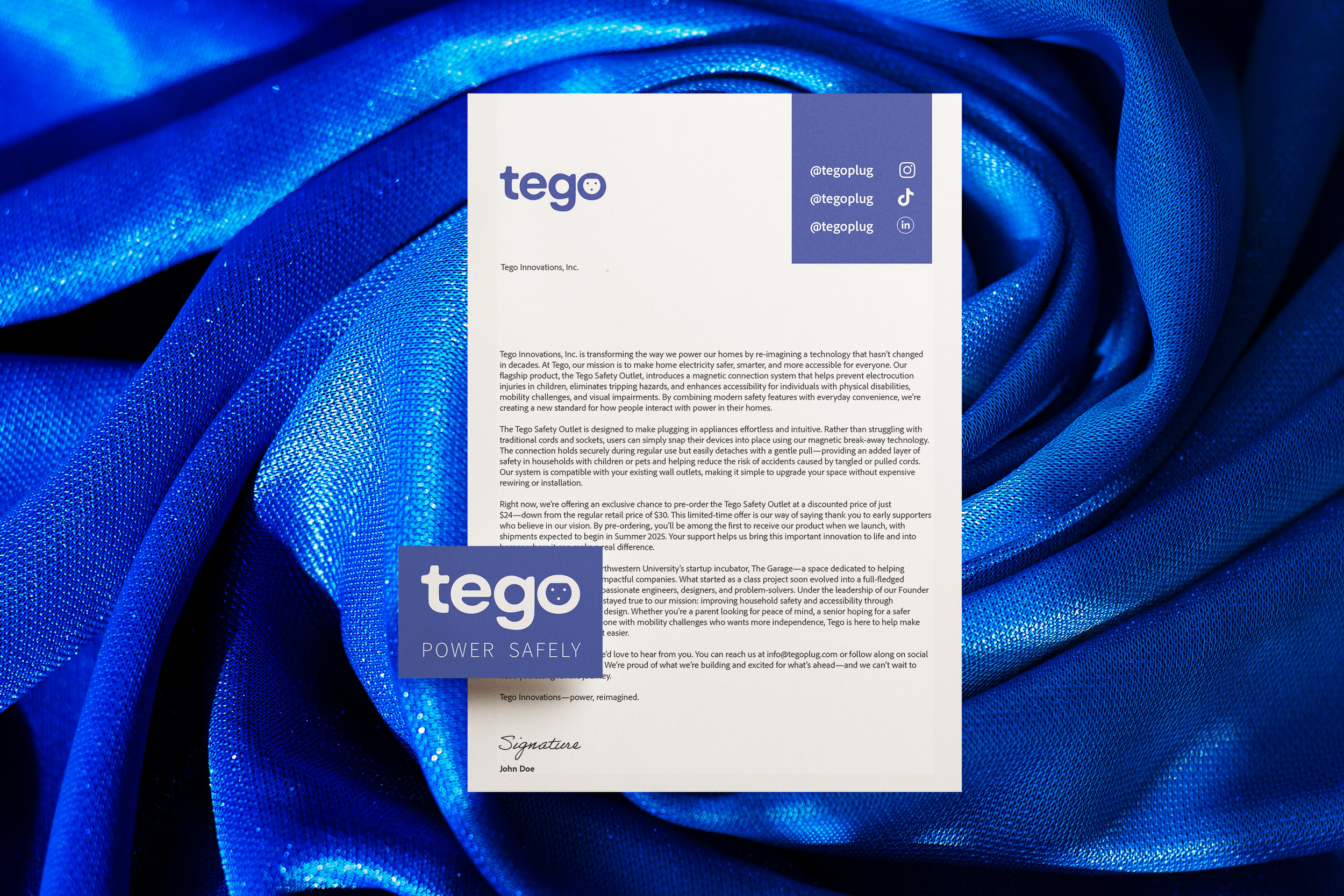
Tego’s stationery and letterhead system embodies the brand’s modern, safety-forward identity. Featuring a clean layout, accessible typography, and the updated logo with its subtle magnetic motif, each element reinforces Tego’s commitment to thoughtful, inclusive design. The materials strike a balance between innovation and approachability—perfectly suited for a brand reimagining everyday home essentials.